It’s not enough to make a pretty form and cross your fingers. These optimized donation pages make fundraising simple and beautiful, too.
Laura Rowley’s On Target: How the World’s Hottest Retailer Hit a Bull’s-Eye, describes Target’s customer service in the 1980s as nothing short of listless, indifferent interaction. Now, Target is one of the world’s largest retailers. And here’s partly how that happened:
In 1989 Target’s executives borrowed an idea from The Walt Disney Company’s playbook to change the very way they did business. It wasn’t a big logo design overhaul. It wasn’t a branding and color change. Instead, Target sought to emphasize the importance of dedicated, expedient customer service.
Target started designing intensive employee training modules, now known as Target University, to help employees project a sense of care and individualized attention for each customer. They encouraged managers to make quick, “common sense” decisions that benefited the customer, like allowing flexible refunds and substitute purchases.
But Target didn’t stop there. Target’s executives doubled down on the notion that would later become its tagline: “Expect More. Pay Less.” For Target to be different from the competition, it had to think different. This wasn’t as seemingly cliché a notion in 1989 as it would become in the post-iPhone era.
At Disney World, for example, costumed characters are not referred to as such. Snow White — and whatever poor souls are in the Monsters Inc. costumes that day — are not employees or actors, but “Cast Members.” Likewise, Target from thereon out referred to its employees as “Team Members,” who then considered each customer a “Guest.”
The word “customer” is pedestrian. Timeless, but pedestrian. I hear it at least 50 times a day, every day. But a “Cause” is different.
By the next year, the first Target Greatland, which is 50% bigger than a regular Target, opened in suburban Minneapolis. Not bad for a company that used to lag behind Kmart.
Target’s success is the result of what happens when you pay attention to minute details. And when you work for a company that helps thousands of nonprofits have online presences, it gets dangerously easy to miss the small things. That’s why we refer to our clients as “Causes,” not “customers.”
The word “customer” is pedestrian. Timeless, but pedestrian. I hear it at least 50 times a day, every day. But a “Cause” is different. You might think that’s an entirely arbitrary naming scheme, but that’s kind of the point. Because if you don’t think of each Cause on a case-by-case basis — what they do, what they need, who they interact with — then the Causes are no longer unique. Pretty soon after that, they won’t be your “customers,” either.
Putting our Causes’ priorities before our own means that we have the ability to help ourselves by helping them even more. Because they have to pay attention to other fine details, too. And we felt like celebrating their hard work.
Last December we ran a contest to see which cause had the best-optimized, best-designed donation forms on their website. We received a number of great submissions and had a hard time making the choice ourselves. So we put it to a vote.
We linked to a survey on our email newsletter, posted a poll on our Facebook page, asked our Salesforce® HUB group members to participate… the whole nine yards. We asked participants to rank the top eight forms from 1 to 8 — 1 being the respondent’s most favorite, and 8 being the least favorite.
Without further ado, let’s go to the winner’s circle.
3rd Place — SARA (Sexual Assault Response and Awareness)
Where: Roanoke, VA
What They Do:
- Provide counseling, legal, and medical resources to victims of sexual assault.
- Support via 24-hour crisis hotline.
- Raise public awareness via educational community workshops, dispelling myths and challenging misconceived attitudes.

Screenshot taken from sararoanoke.org
What Voters Said
“The image is evocative and illustrates the purpose of the charity without being exploitative or gimmicky. The colors are striking and somber without being depressing, and actually still manages to convey hope. [It’s] the only form that tells donors exactly what the dollar amount of their donation supports.”
“The image is poignant, the donor gifts are specific and tangible, the page is easy to see and use.”
“It specifically tells me where the money will/can be spent.”
What SARA Roanoke Said
“We are new to receiving online donations, but Click and Pledge has made this process much easier for us. We know that people like to donate quickly and easily. Through creating this form, we know people are likely to follow through with their donations because it has SARA’s brand and specifically states where donations go.”
2nd Place — DC SCORES
Where: Washington, DC
What They Do:
- School-based, team-based child programming for DC natives to develop physical, mental, and emotional fitness
- Free after-school and summer camp programs integrate soccer, poetry, and service-learning.
- Partner with and train local public school teachers and coaches to mentor 3rd-8th graders within the District.

Screenshot taken from dcscores.org
What Voters Said
“DC Scores was dynamic and without words I know what I am supporting. Love smiling kids, form was not complicated and kept my choices simple.”
“Easy to read, inspiring image that makes you feel good, clear and simple.”
“I like the color scheme and it’s a very effective image.”
What DC SCORES Said
“We felt the need to change and customize our form so as to make it as mobile-friendly as possible. Our IT guru Sean Hinkle put together a few drafts, with an emphasis on simplicity. As we went through edits, we tried to put ourselves in potential donors’ shoes — what is aesthetically pleasing? What form will be easiest to navigate for a person in a rush with their phone?
Click & Pledge plays a large role in DC SCORES meeting our vision for a DC where every child – no matter their family income – experiences the joys of childhood: sports, arts, service, and being part of a team.”
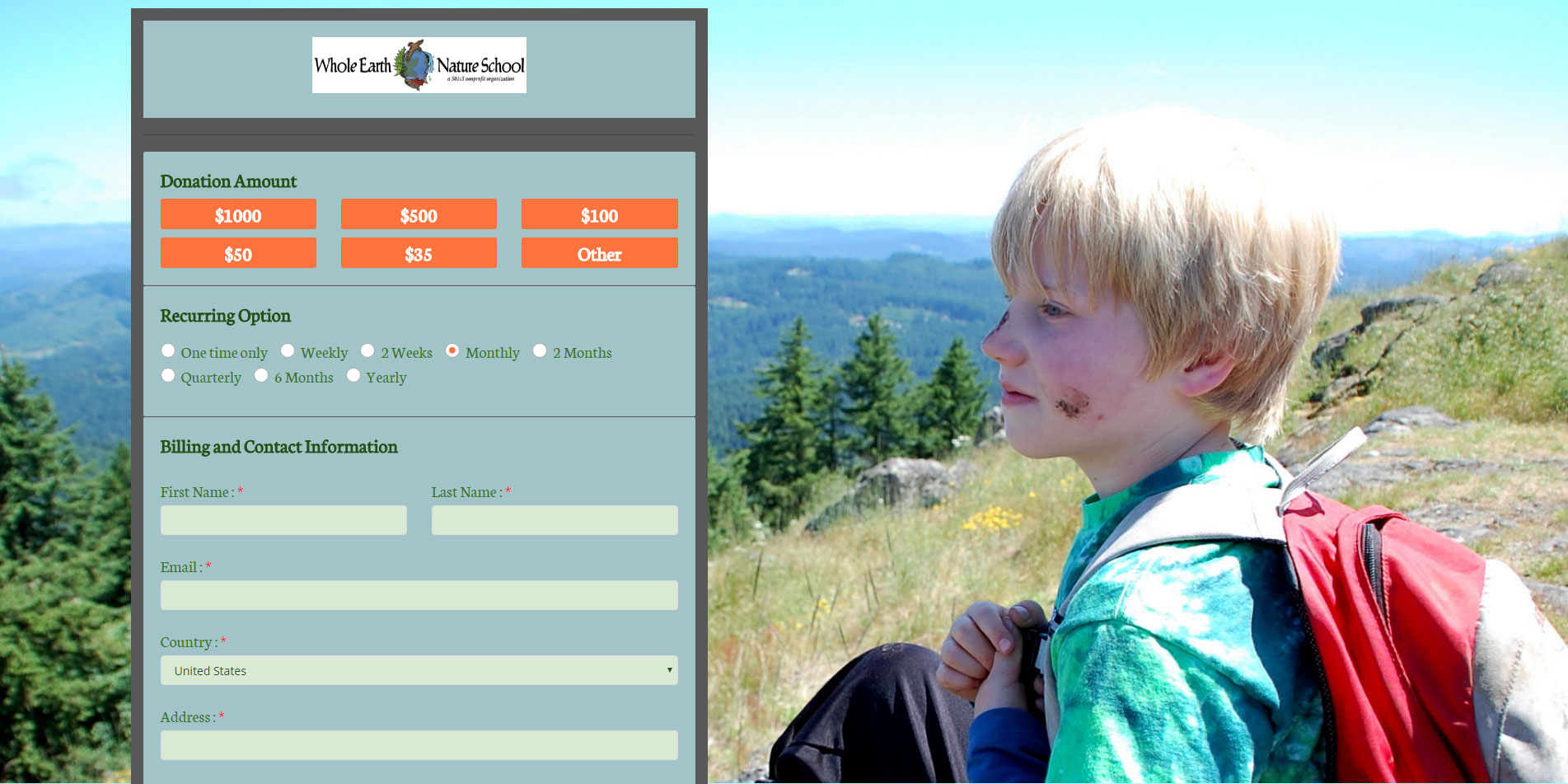
1st Place — Whole Earth Nature School
Where: Eugene, Oregon
What They Do:
- Instill a sense of adventure and a respect for the environment through a series of season-long and after-school nature camps.
- “Environmental education” opportunities provided for children and adults to reconnect with the natural environment.
- Develop nature survival skills, including fire preparation and identifying edible plants for sustenance.

Screenshot taken from wholeearthnatureschool.com
What Voters Said
“The colors are well chosen, and emulate the love of mature at the core of this charity. I like that it doesn’t look like a form-based website. It looks professionally designed.”
“I love the image of the child in nature which helps represent the mission of the organization. The form is clean and easy to use without unnecessary clutter.”
“The picture depicts service. Form is clean, precise, gives suggested amounts, straightforward. The whole thing is appealing.”
What Whole Earth Nature School Said
“We had a wonderful experience using this form during our year-end fundraising campaign in 2016 and I am certain it helped make transactions smoother for our donors to give. The ability to personalize the background of the donation form is key and so we chose an image of a student in nature that encompasses our organization.”
So What Are Donors Looking For? (tl;dr It Depends)
There’s a relatively poignant theory in User Experience design that users don’t know what they want. This explains why people flip their lids when Facebook rolls out a new homepage design, but they get used to it after a couple of weeks.
But feedback also helps us define the “bar” — our base level for best-practices when designing our webpages and forms for the future. Just take a look at this wordcloud to help you generate some ideas:

Standout words from our survey response include organization, background, image, colors, simple, and easy-to-navigate, among others. All these words call to mind the types of donation pages you commonly see associated with crowdfunding campaigns.
Because crowdfunding platforms have to accommodate a wide range of causes, they’re inherently optimized to appeal to and work well with a diverse group of page visitors. The pages are simple and easy-to-use. They’re extremely visual and contain images that get right to the heart of the cause.
Your nonprofit can take a cue from the top crowdfunding websites and design a page that will resonate well with a range of users, just like our survey winner Whole Earth Nature School was able to do.
If you’re looking for some suggestions, here are a few common elements the best forms use to attract donations:
- They keep it simple. Unless your visitor is a recurring donor, there’s a strong chance this is the first time that he or she is navigating your form on-the-fly. The less they have to actively learn how to read the form and donate to your organization, the better.
- They keep it brief. This is along the same lines as simple, but they’re not exactly the same thing. You’ll notice these forms don’t bombard you with mission statements, success stories, and the like. They break up their content based on user intent. They understand that if you’re on the “Donate” page, you’re more likely to donate. If you’re on the “About Us” or “What We Do” page, you’re probably looking for more information.
- Their pictures tell a story. Not just any story. Their story. A faceless, anonymous woman. A youth soccer team enjoying a lovely spring day. A young boy with dirt on his face taking in nature’s sweet serenity. Each winning organization used a captivating, colorful full-screen image that complements their mission statements. The lesson: context is key.
- They leverage their brand. The logos are consistent. The design colors match the logos. The images capture the respective ethos that each organization propagates. If your picture speaks a thousand words, then your nonprofit’s brand is the book in which they’re written.
When design elements are coordinated carefully to jibe with one another, you communicate emotionally that you care about your reputation to potential donors. Eventually, they may even communicate their interest and ownership of your Cause in the form of brand evangelism.